HELLO, LESLY & TYLER!
Welcome to your
Sela Vie Style Guide.
The following page depicts our proposed strategy for visual direction and messaging emphasis on behalf of your business.
Why does this initial overview matter, and how should you process what it contains?
The outward representation of a successful business is always deeply rooted in internal strategy. It’s important that you specifically identify your target audience, understand their perspectives and priorities, and build a website that communicates your understanding via visual and tonal aspects. Simply put, an effective website doesn’t just look good, it connects deeply with its visitors.
Your assignment is, therefore, to process this document from the perspective of your target audience and in alignment with your broader goals for the future of your business. Rather than narrow your focus to a particular image, font, color, or word, consider the net effect of these elements combined to produce a mood or feeling that will connect with your target audience.
MESSAGING EMPHASIS
COHESIVE MANAGEMENT
LIVEABLE ELEGANCE
PERSONALIZED PROCESSING

TAGLINE
Cultivating elegant spaces with modern, comfortable, and creative design.
FONTS
Header 1
Header 2
Header 3
Body copy
HERE’S WHAT THIS LOOKS LIKE
As an example
With a subheading, header, and some body copy
COLORS
BRAND CONCEPT
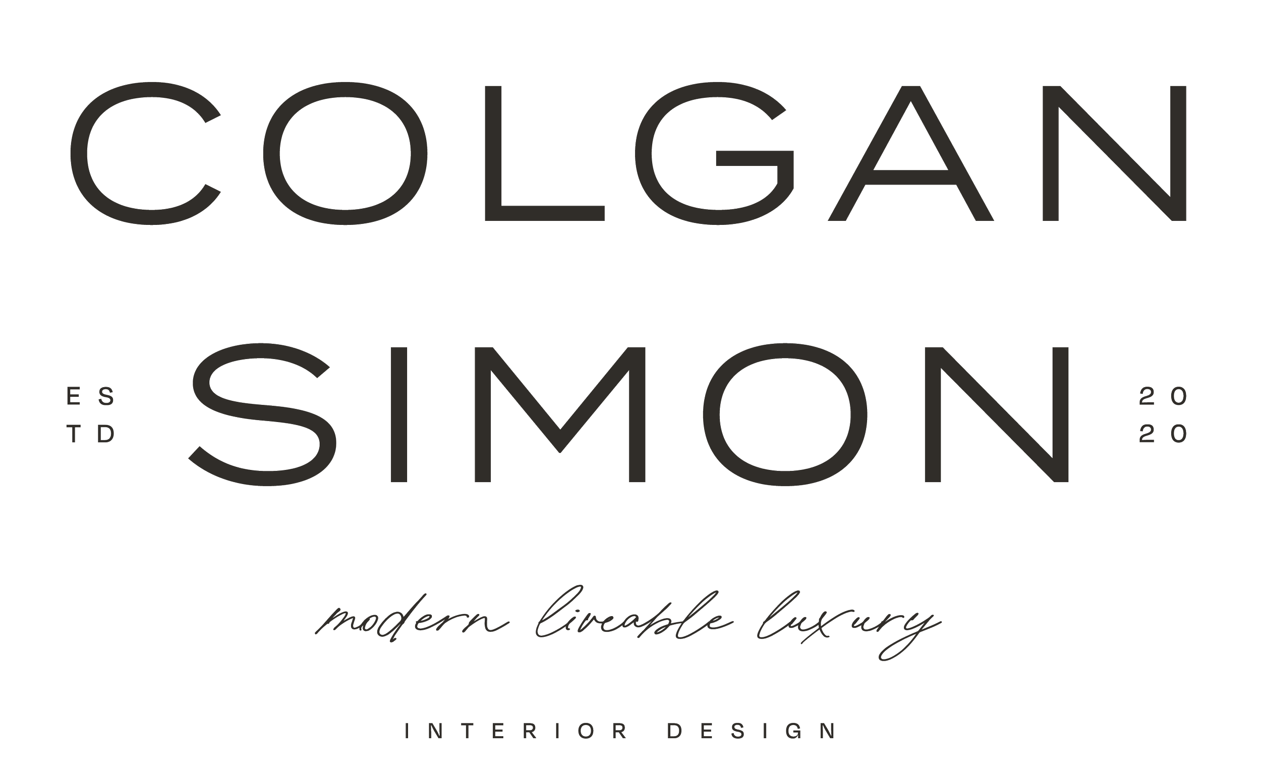
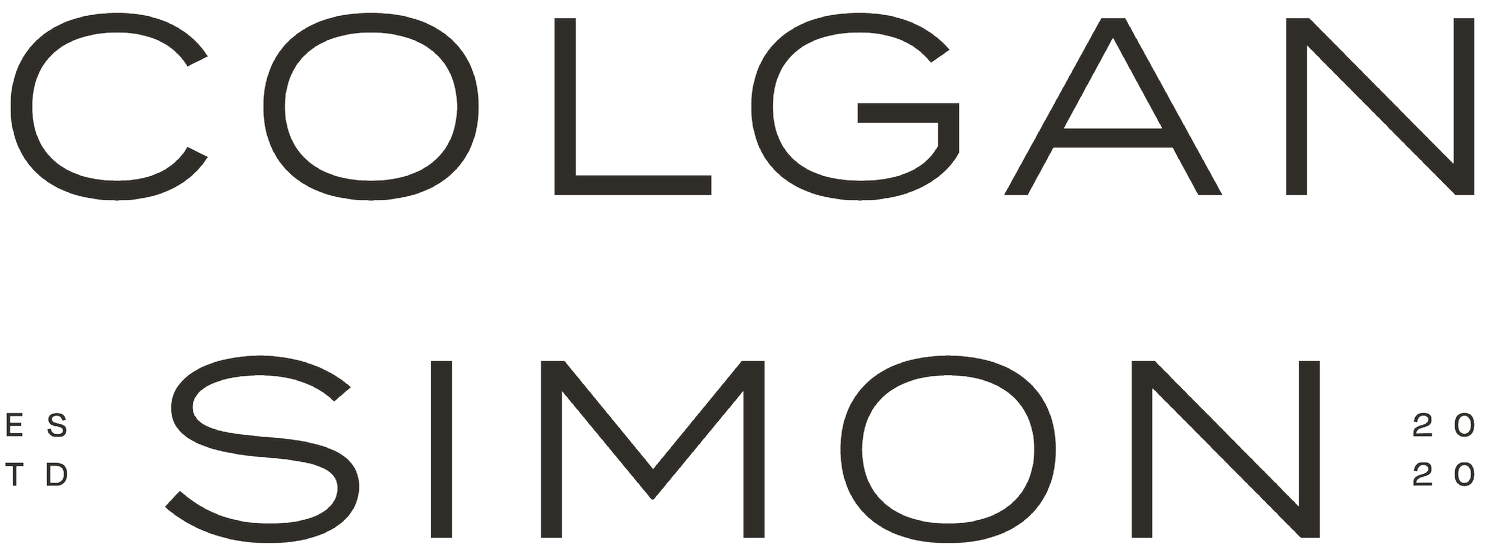
PRIMARY WORDMARK LOGO

SUBMARK
WE HOPE YOU ENJOYED YOUR STYLE GUIDE
Here are your next steps!
As a reminder, your assignment is to process this document from the perspective of your target audience and in alignment with your broader goals for the future of your business. Rather than narrow your focus to a particular image, font, color, or word, consider the net effect of these elements combined to produce a mood or feeling that will connect with your target audience.